m̄enom̄eno
卸下華麗的需求,從人的最基本出發
meno在義大利文中代表minus,品牌以減法保養為主旨,褪去過多的裝飾回歸初心,主張簡單最美。設計裡,以中性的基底呈現品牌的理性,以包裝的留白與原始的包材呼應品牌的精神,最後融入創辦人玩味、搞怪的心意,呈現整體品牌識別。
meno在義大利文中代表minus,品牌以減法保養為主旨,褪去過多的裝飾回歸初心,主張簡單最美。設計裡,以中性的基底呈現品牌的理性,以包裝的留白與原始的包材呼應品牌的精神,最後融入創辦人玩味、搞怪的心意,呈現整體品牌識別。
Put aside the luxurious desire, but start from the essential.
‘Meno’ means ‘minus’ in Italian. The brand focuses on subtractive maintenance for the skin, shedding decorations but return to the essential. The brand believes that simplicity can bring out the beauty of nature.
In terms of the design, we set with the neutral tone for the visual identity. The spirit of the brand is echoed with the packaging that shows the material textures and the space for breathing. While the playful layout of the English letters presents the core of the brand, ‘be the unique yourself’.
-
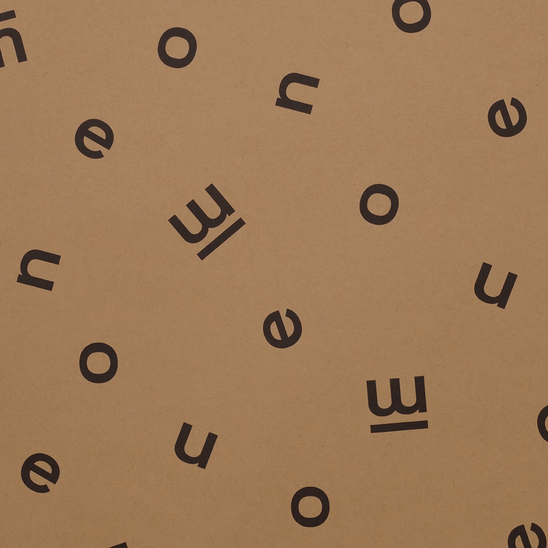
基本設計系統 Basic System
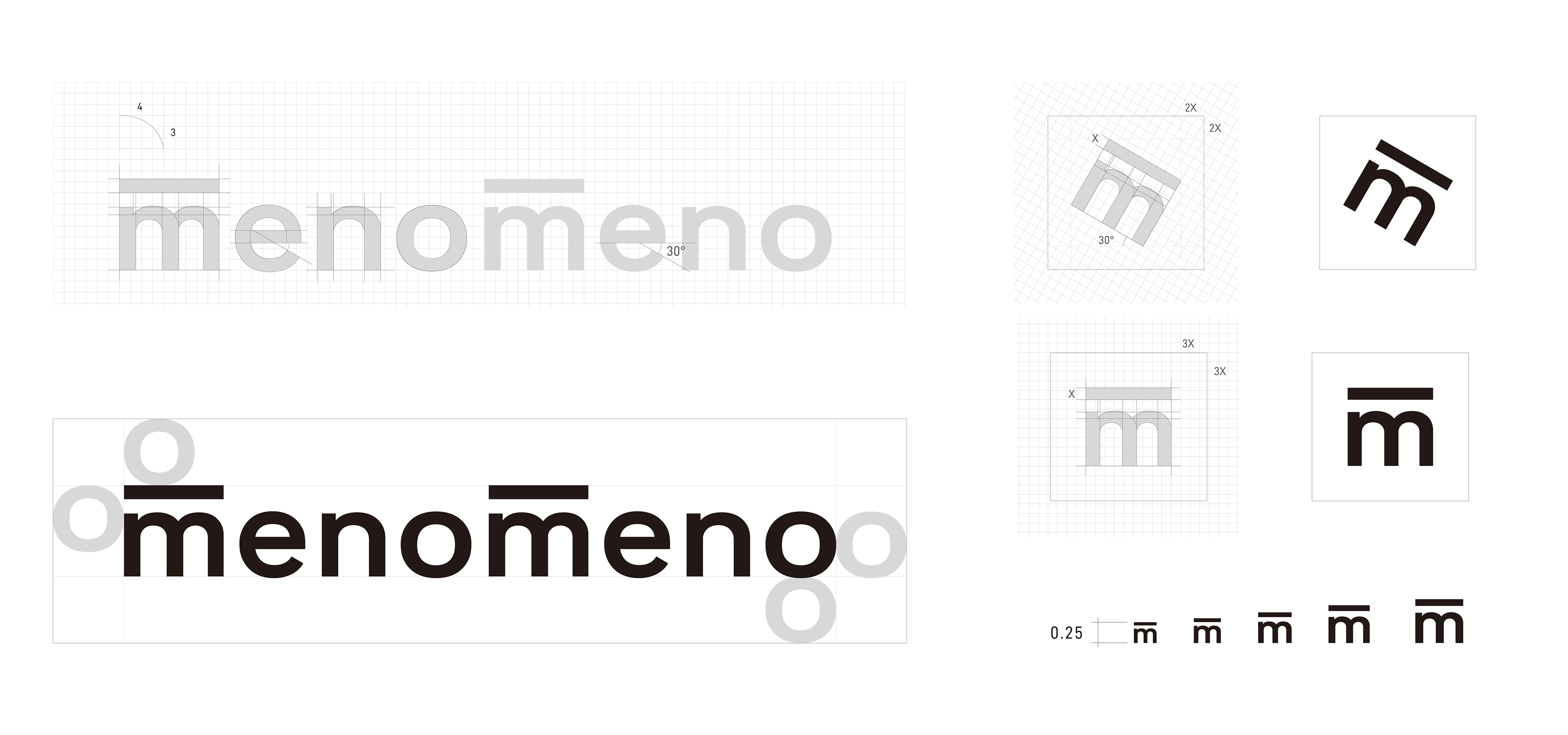
menomeno品牌視覺關鍵字:中性、感知、獨特。
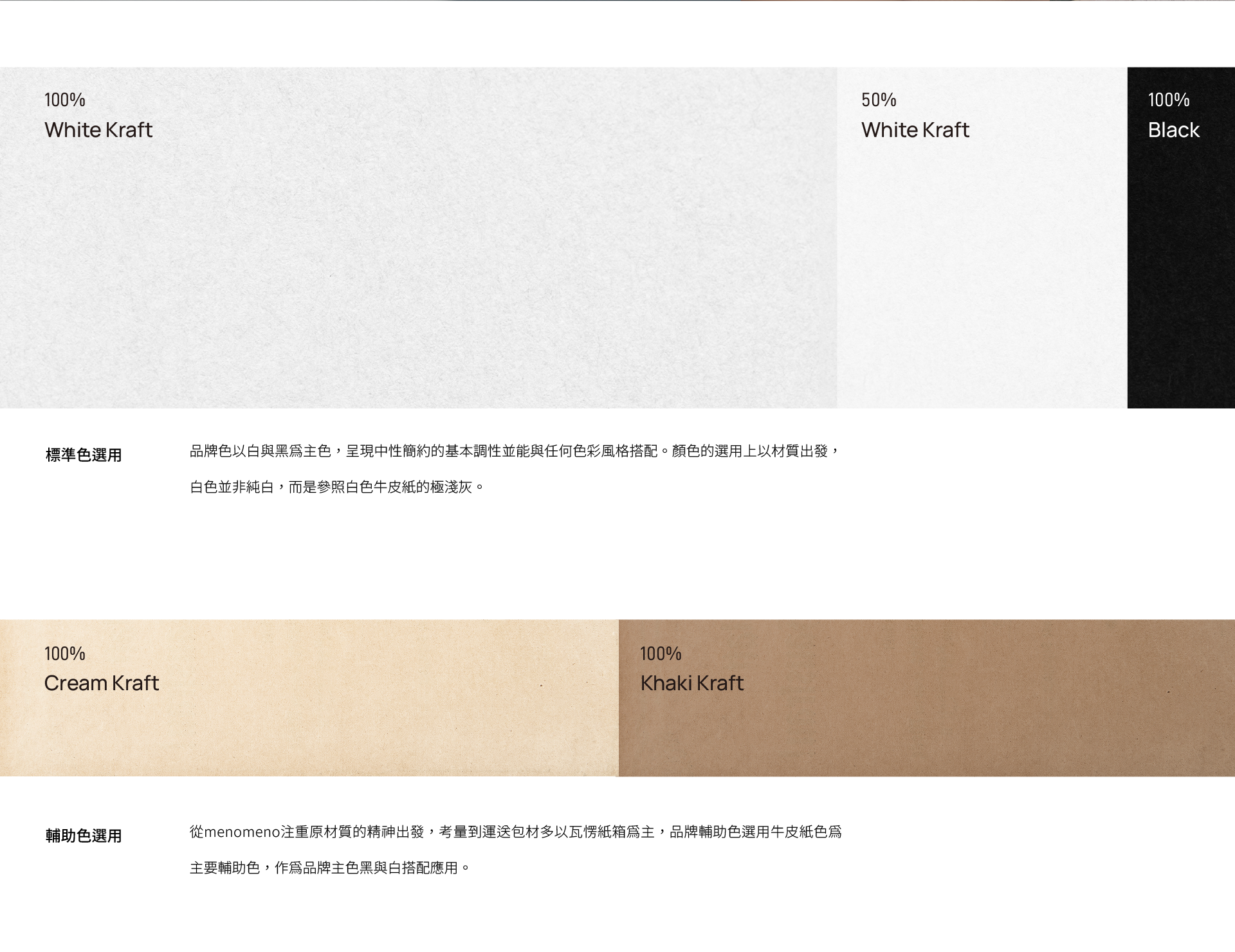
呼應品牌的減法理念,視覺設計以簡約黑體字母作為基本元素,並在格線系統的理性基底上,透過旋轉與縮放創造變化,呈現創辦人玩味搞怪的性格。品牌用色以黑白為主,搭配包裝紙材的原色作為輔助,建立整體自然簡單的調性。
呼應品牌的減法理念,視覺設計以簡約黑體字母作為基本元素,並在格線系統的理性基底上,透過旋轉與縮放創造變化,呈現創辦人玩味搞怪的性格。品牌用色以黑白為主,搭配包裝紙材的原色作為輔助,建立整體自然簡單的調性。
During the process of clarifying the brand values, three keywords were set: neutral, perceptual, unique.
Based on the keywords, the visual design uses bold gothic letters as the basic elements, and on the rational basis of the grid system. Through rotation and scaling of the letters, the layouts are various, presenting the fun and playful spirit. The brand color palette includes black, white, and the natural craft paper color, which would be easily applied for the packaging materials, meanwhile establishing an overall natural and simple tone.
Based on the keywords, the visual design uses bold gothic letters as the basic elements, and on the rational basis of the grid system. Through rotation and scaling of the letters, the layouts are various, presenting the fun and playful spirit. The brand color palette includes black, white, and the natural craft paper color, which would be easily applied for the packaging materials, meanwhile establishing an overall natural and simple tone.

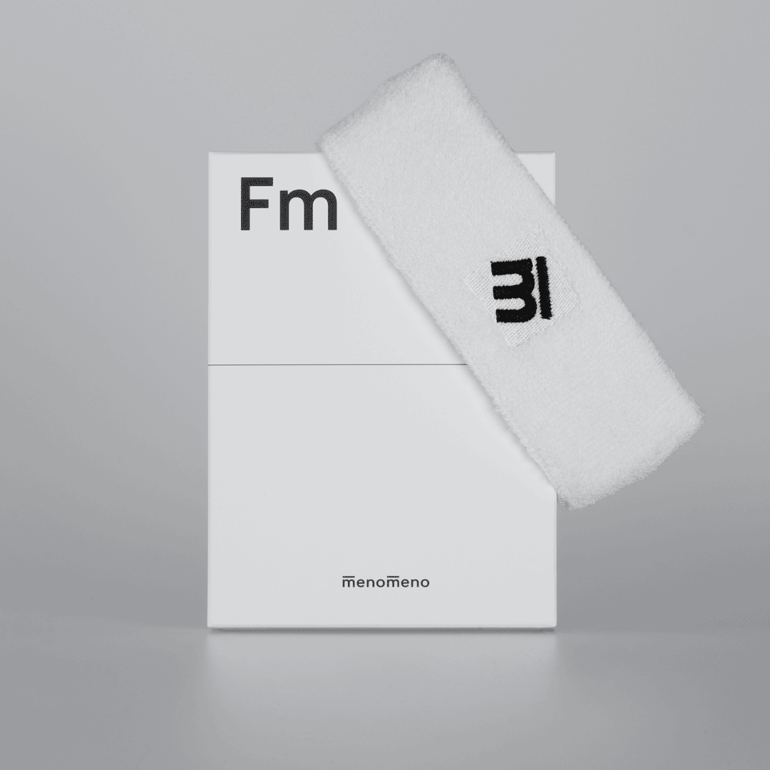
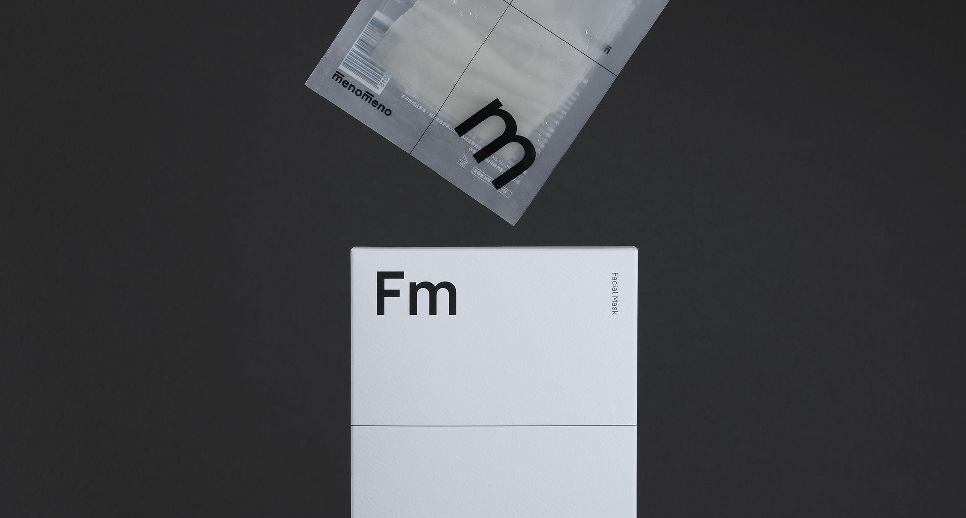
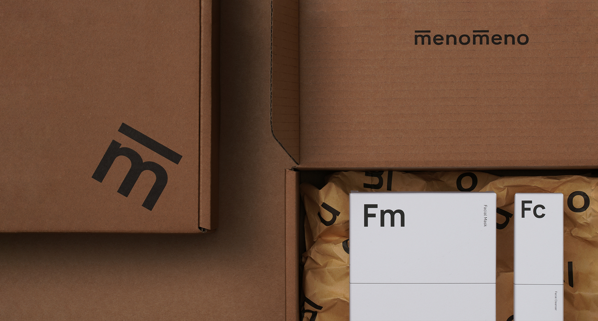
應用設計系統 Application System
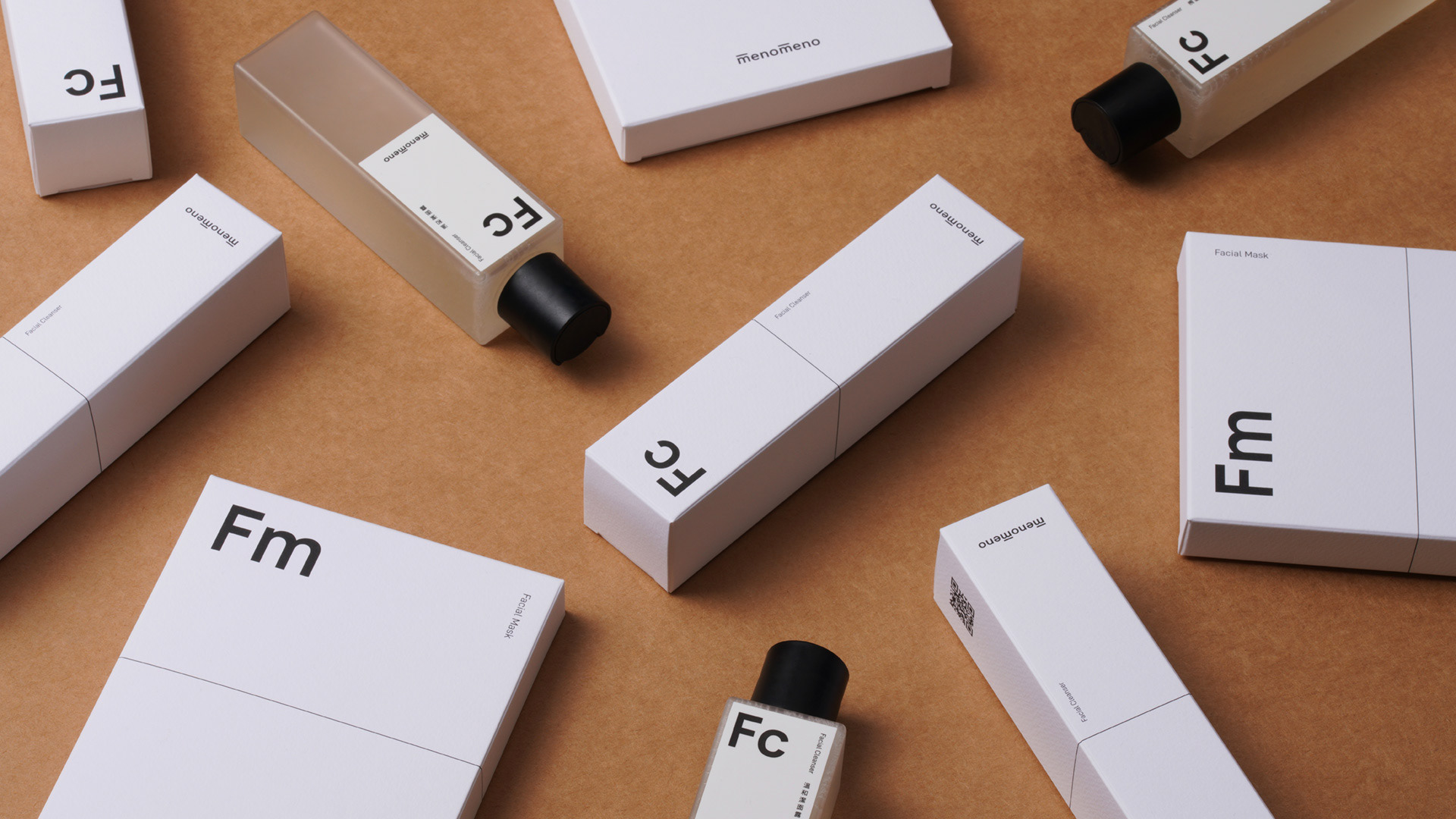
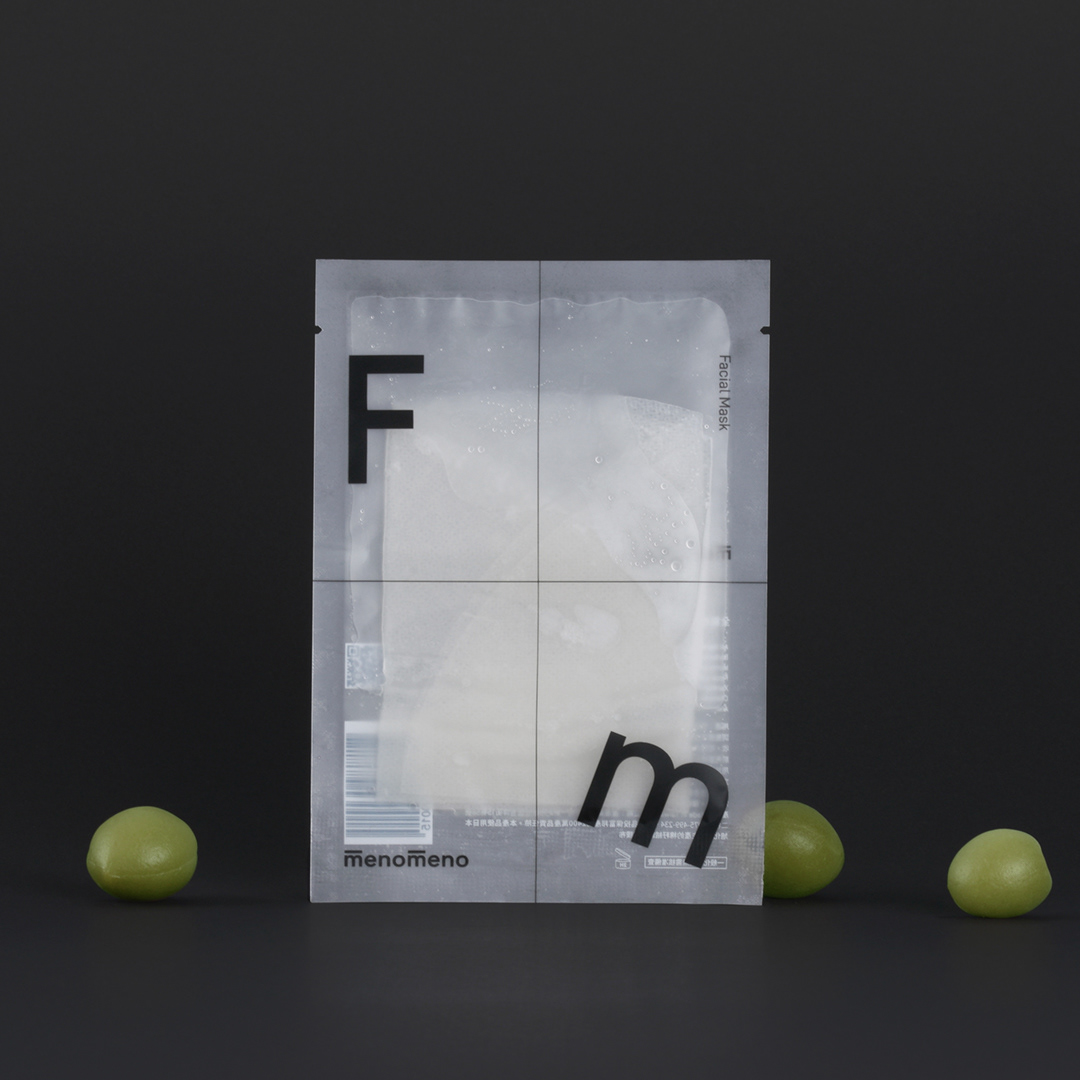
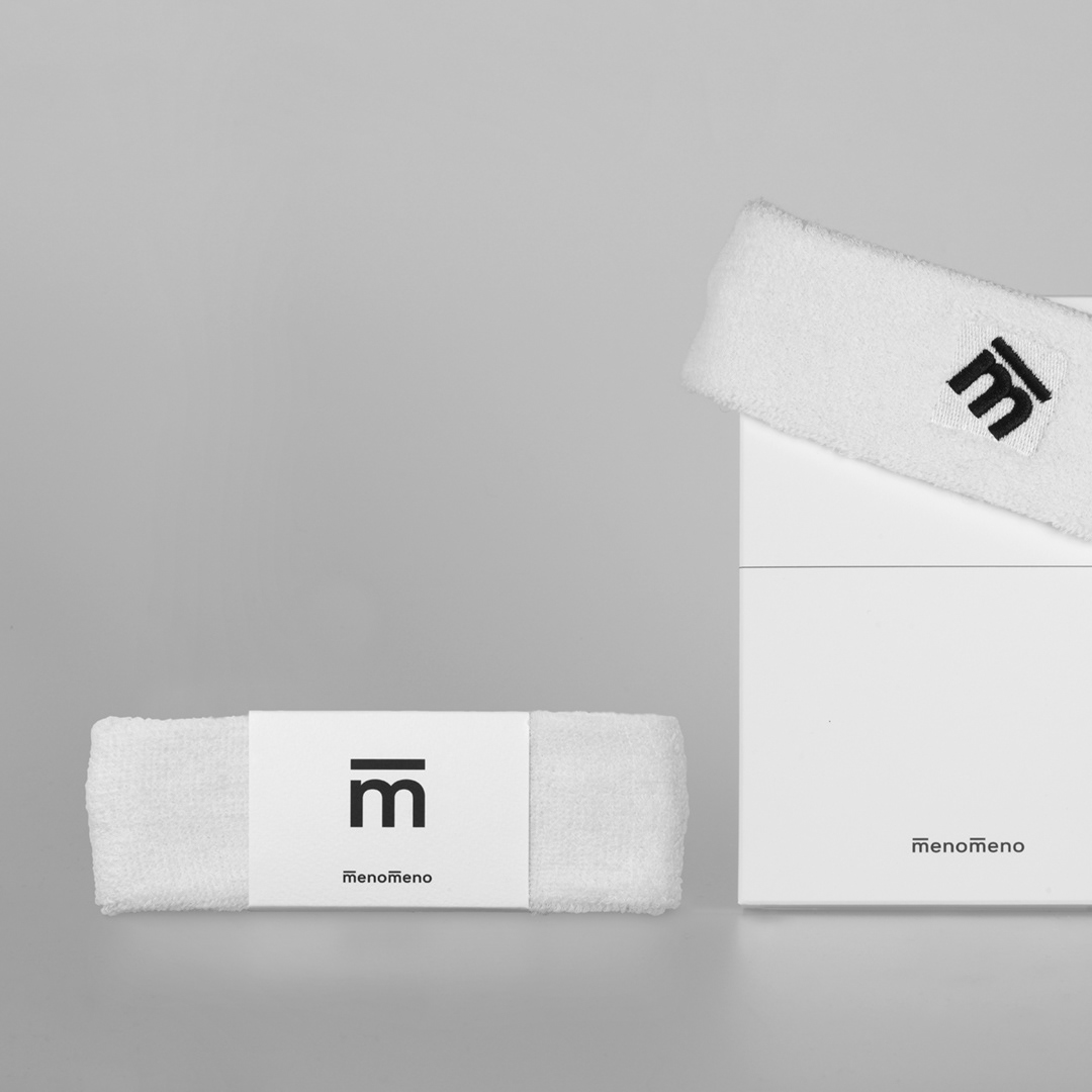
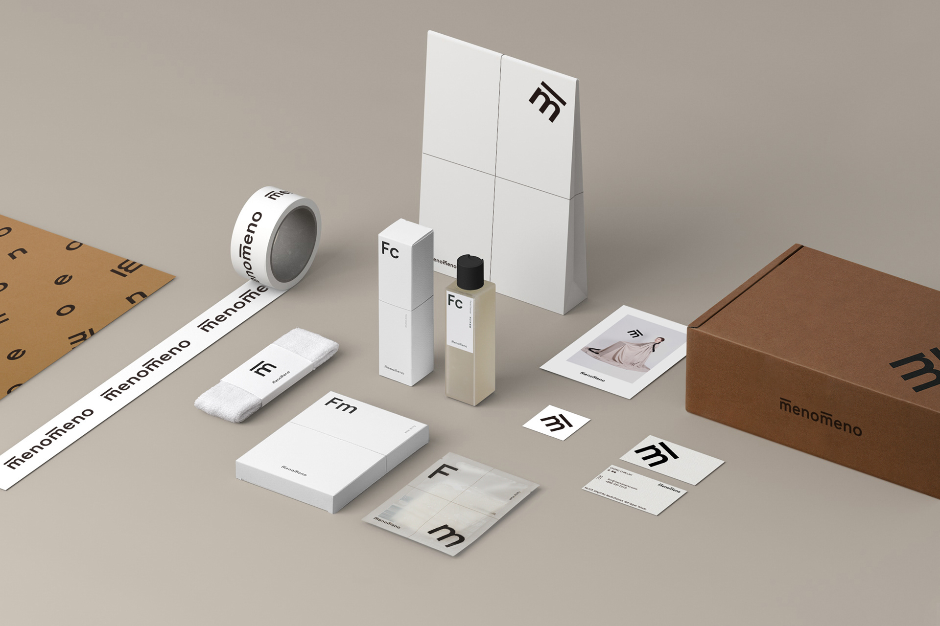
由menomeno品牌精神「除去裝飾,找到自我」延伸,保養品包裝多選用半透明材質,以展現保養品原貌。其他輔助包裝也都以展現原材料色為主,避免過多印刷。基本系統的應用開展,理性的格線系統延伸至產品構出的立體空間,而自由的字母跳躍其中。
‘Take off the decoration, find the true self’
To echo with the spirit, the concept of the application system is to ‘show the nature of the product’. Therefore one of the important material for packaging is transparent. And not only packaging but all printed matters have to use less printing but show the raw materials.
To echo with the spirit, the concept of the application system is to ‘show the nature of the product’. Therefore one of the important material for packaging is transparent. And not only packaging but all printed matters have to use less printing but show the raw materials.

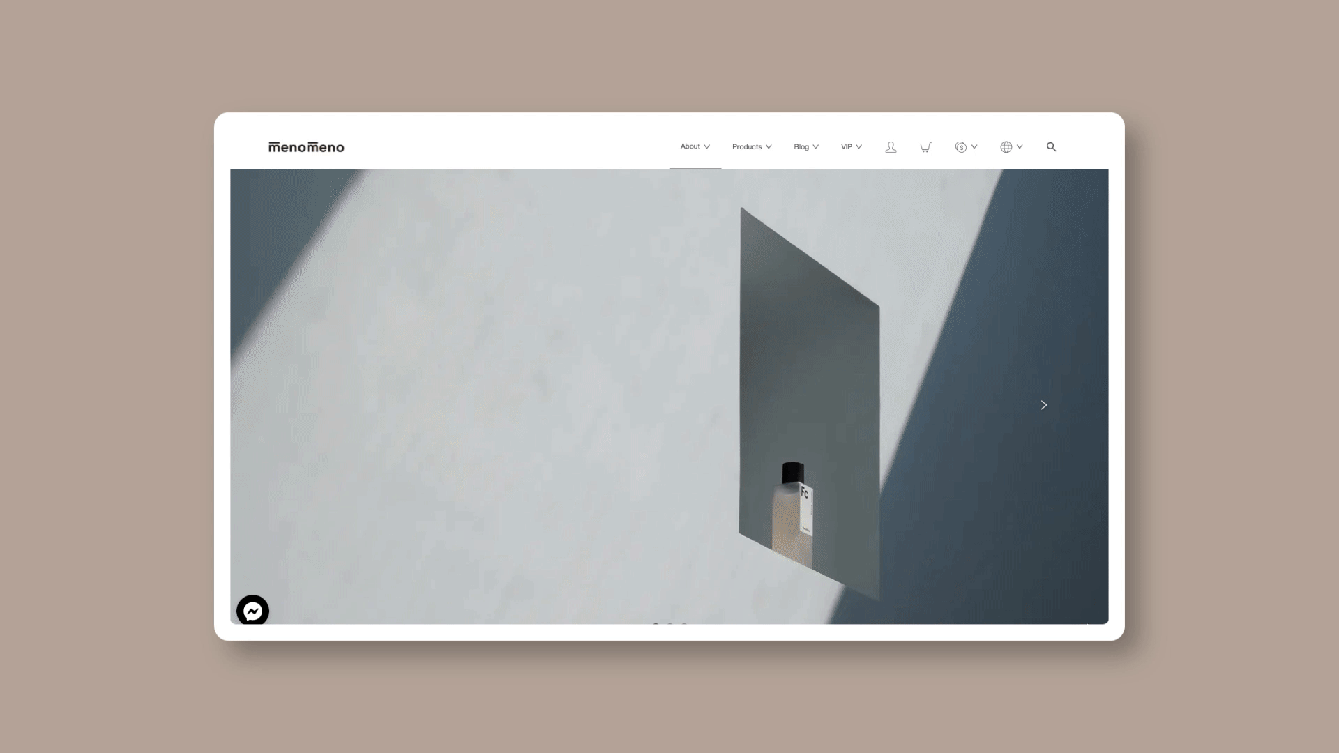
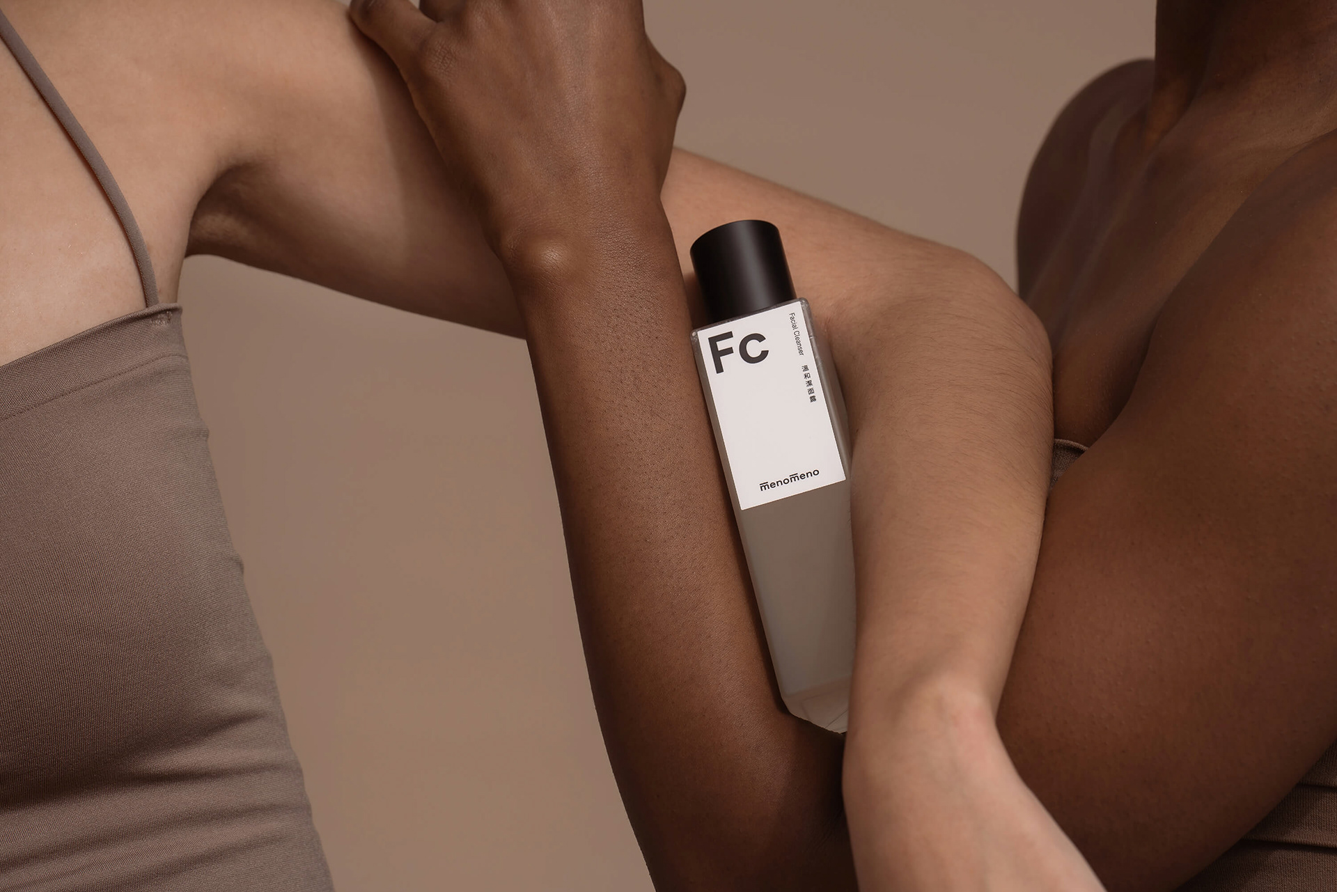
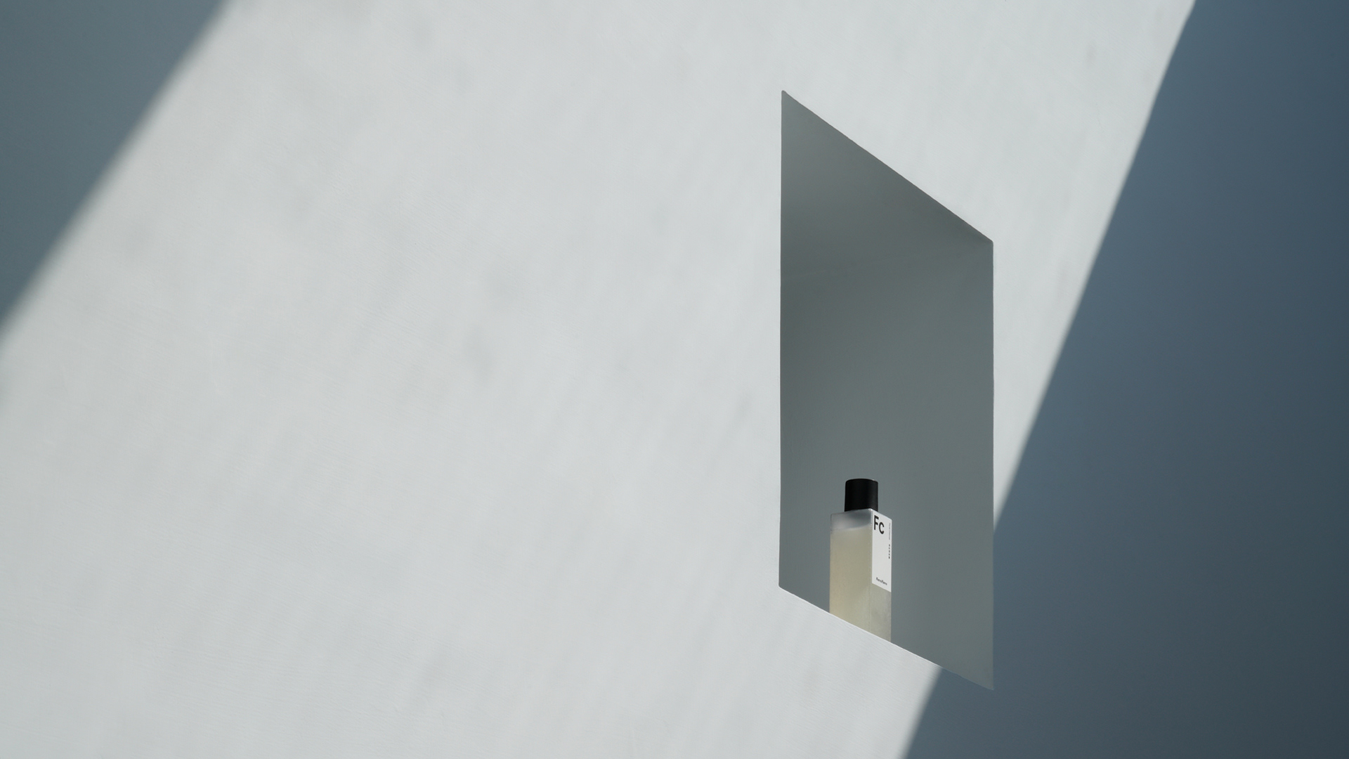
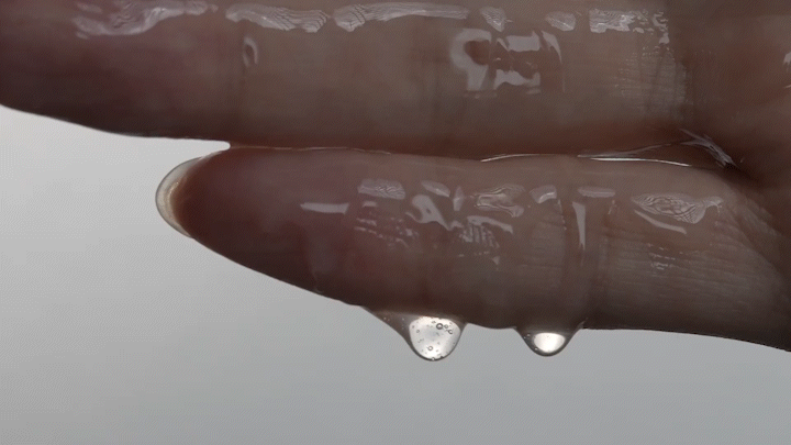
產品形象拍攝 Photography of Products
產品拍攝藉由建立畫面中的幾何構成並同時打亂他,來傳遞品牌理性卻搞怪的個性。也透過具故事感的排列、原材料的搭配以及質地特寫,賦予保養品本身新的個性,讓品牌溝通的重點回歸到產品本身。
Through the arrangement full of narratives and playfulness, the characteristics of the products had new lives. Not showing the beauty of the models or the lifestyles, but returning back to the product itself.
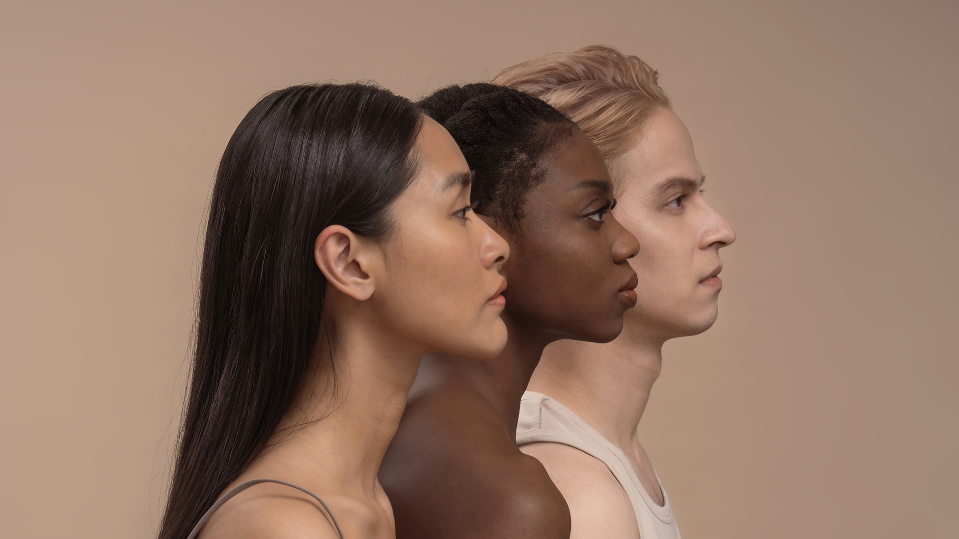
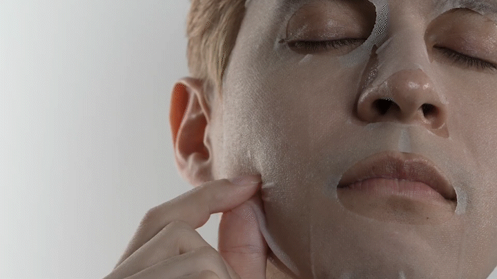
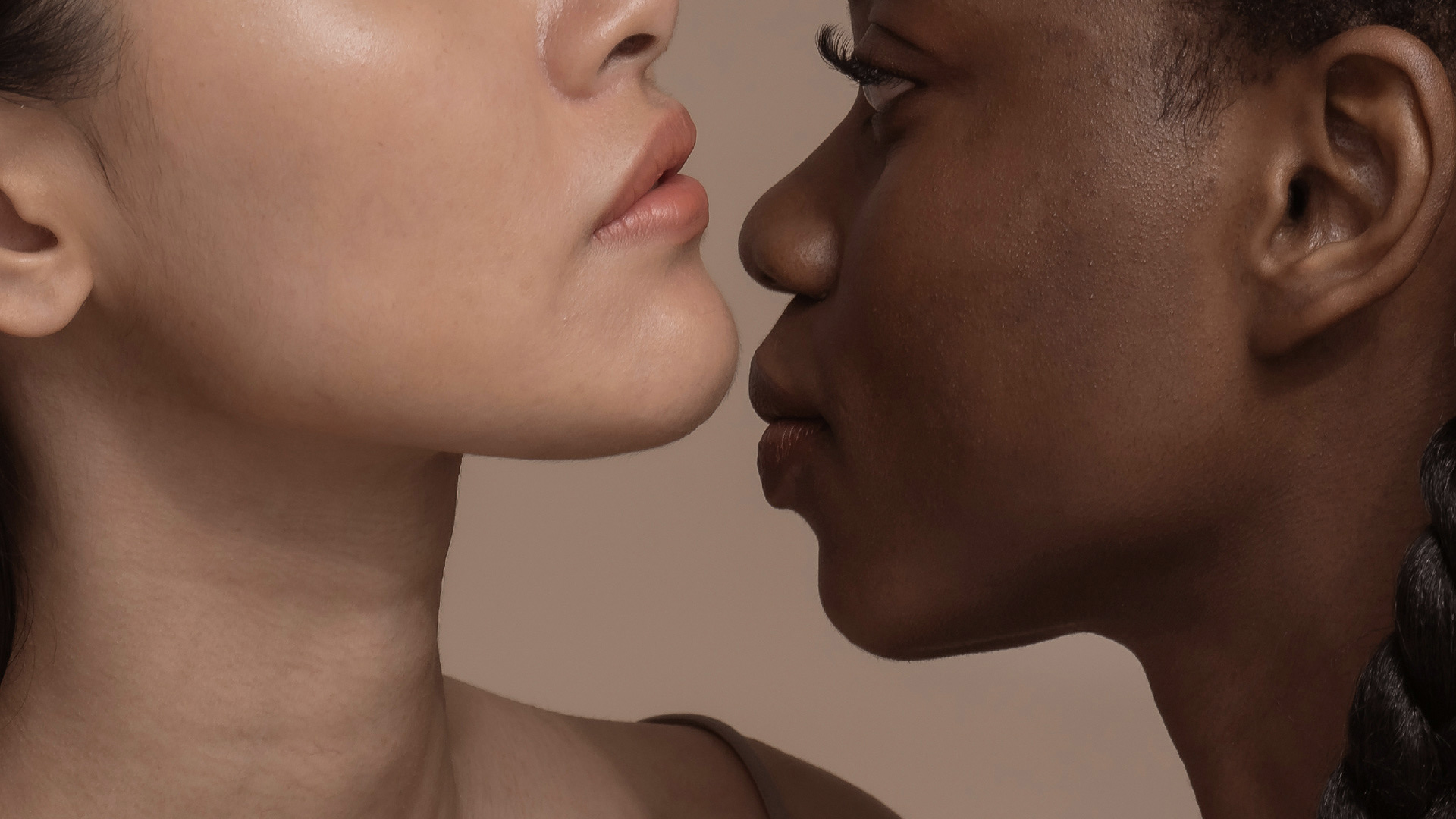
品牌形象拍攝 Photography of Brand Image
以「傳遞真實」為品牌形象拍攝主軸,著重於展現皮膚與產品的親密關係。透過特寫與打光凸顯產品與皮膚的質地,並呈現不同膚色、膚質的展現。
'Communicating the Genuine'.
The photo shoot focused on portraying the intimate relationship between the skin and the products. Through the close-up shots and the lighting, the texture of the skins and the products were highlighted. By unfolding the variety of the textures, a new world was open, based on the care to your body and life.
The photo shoot focused on portraying the intimate relationship between the skin and the products. Through the close-up shots and the lighting, the texture of the skins and the products were highlighted. By unfolding the variety of the textures, a new world was open, based on the care to your body and life.
客戶 Client|澄澄嵐有限公司
視覺統籌 Creative Agency|沿岸製作 Atelier YenAn
創意總監 Creative Director|陳彥安 Yen-An Chen
設計總監 Design Director|張庭瑄 Ting-Hsuan Chang
品牌設計 Brand Design|張庭瑄 Ting-Hsuan Chang、張玉典 Dan Zhang
形象攝影 Photography|楊峻翔 Jun-Siang Yang、修改次數有限公司 final_final studio
創意總監 Creative Director|陳彥安 Yen-An Chen
設計總監 Design Director|張庭瑄 Ting-Hsuan Chang
品牌設計 Brand Design|張庭瑄 Ting-Hsuan Chang、張玉典 Dan Zhang
形象攝影 Photography|楊峻翔 Jun-Siang Yang、修改次數有限公司 final_final studio